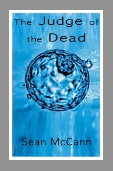
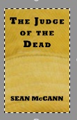
The Judge of the Dead is published – please be careful during the stampede to buy it

Finally, five years after a 1,500 word Open University creative writing exercise sowed the seeds of a 75,000 word novel, The Judge of the Dead is published.

Here’s me and my proofy of egduJ ehT daeD eht fo by nnaCcM naeS:

Photo on 2015-07-29 at 10.10

Excuse the topless shot. I’m in Andalucia, it is corking hot at the mo, and I haven’t been feeling 100% this week.

I actually published on the 26th, but it can take a few days to filter through to Amazon so I delayed the grand announcement, pyrotechnics and whoopwhoops until today; didn’t want to send people scurrying off to eStores only to find it wasn’t available yet.

On that note, the ebook is £3.99 via Kindle , while the paperback is £7.99. That’s higher than intended but (UK) printing costs swallow slightly over 50% of that and Amazon take 40% so it doesn’t leave a lot for little old me. I make significantly more on the paperback if I sell through the CreateSpace eStore so if customers from the Americas can buy through them (ships in 5 days for $3.59 at time of writing) that would be massively appreciated. UK customers might find the quickest delivery is from Amazon UK, but they charge the highest printing costs, much more than Amazon.com or Amazon Europe, so unless you know me well enough to get a copy signed, or you just love the feel of a paperback in your hands, I’d suggest going for the ebook version. It’s cheaper for the reader, and makes more margin for the author, so it is a win-win purely on the money front.

Back to the book itself, I had to choose two genres to categorise it by. I went for ‘Crime’ and ‘Technological thriller’. I think the word ‘thriller’ is daft – I’ve never been thrilled reading a book – but I had to choose something so that was as near as I could get it (more for the ‘technological’ than ‘thriller’). If it doesn’t thrill you, then I apologise, but there wasn’t a category entitled ‘Barely perceptible pulse quickener’.

As I’ve mentioned before, the book may prove somewhat of a challenge for readers used to getting to the end of page 1 and thinking ‘Alright, this is my protagonist, this is ‘me’ for the remainder of this story, I know who I am and what’s going on’. My novel, on the other hand, is told through the eyes of six different first-person narrators, so the reader won’t really have a clear feel for who to get behind until the end of chapter 6, once all the main characters have been introduced. This for me brings a semblance of reality somehow. We all like different people. To my mind there is an obvious hero but readers may decide some of the other characters are attractive in various ways. Some people adore Jeremy Clarkson, whereas I think he needs a biff round the head. Each to their own. I didn’t deliberately set out to write characters that way, but I think ambiguity exists in most people, so your villains with a caring side and upstanding members of the community with a darker side both have degrees of plausibility.

The story will probably appear stylistically uneven from chapter to chapter. Again I feel this reflects the way different people tell stories in real life. Some will stick closer to the essence, while some will exaggerate wildly and perhaps even make bits up to make themselves look interesting, cool, whatever. Honeydew, the escort girl, opens the book. To my mind she is out of the noir genre, a bit like one of the characters from the film Sin City. She is all persona, but there is a real person behind that persona. Magnus takes over in chapter 2 and he presents a world a bit more ‘true crime’, London villain stylee. Chapter three reads more like espionage-cum-technothriller, and so on. You might find you need to feel your way into the story, but by a quarter of the way in the picture should start to reveal itself and build towards the pay-off for the reader. It was written to entertain, in terms of both humour and aesthetics, so I sincerely hope anyone that buys it thoroughly enjoys reading it, as a reward for supporting the little guy.

As a final reminder, here, again, is the cover blurb:

‘A fatal legal misunderstanding leads to human embryos being destroyed. The headlines scream: “Rhadamanthus – The Judge of the Dead”. Devastated donor Afro Eccleston smells a rat and resolves to bring down the judge. The security services are onto her but Lucky Jim Ridgewell has an Achilles heel: escort girl Honeydew, linked to East London organised crime. Online auction fraudster Magnus Gilzean has been grassed up, but there is a curious observer in court. If Afro can circle the connections she will set off a carousel of revenge only one can win…’

Over to you, dear reader…

Sean

https://www.createspace.com/5561981

The Judge of the Dead now just a few weeks away (touch wood)

Today I got CreateSpace to send me a proof of The Judge of the Dead. Supposedly it will arrive Wednesday. I doubt the cover will cut the mustard. More of that later. That’s now the only doubt I have over publishing on my intended date of 11 August. If I can pull the trigger before then it could be even earlier.

I did manage to get the cover done before the 4th July deadline but of course it wasn’t hassle-free, me not being an Adobe dude. I couldn’t work out how to export the cover as a single-page pdf; it kept saving it as 3 files: back cover, spine, front cover. Fortunately Bob Levine on the Adobe forums came to the rescue. There’s an option on one of the menus to save as a ‘spread’. I uploaded the file to CS and it was accepted. Job done.

A couple of people on the CreateSpace forums are similarly helpful, namely ‘Walton’ and ‘Lighthouse24’. They seem to operate as a deadly duo, fighting incompetence on every street corner in CreateSpace City. I had a horrendous time using the CreateSpace pre-formatted Word templates, which I’m sure had some kind of hidden section break messing up all the formatting. Anyway, eventually I abandoned the template, building up replicas using the same settings on blank documents, eventually producing my front matter (title page, copyright page, dedication, blank pages where appropriate e.g. to keep page 1 of the manuscript as a recto page, not verso). Word for Mac 2008 was creating multiple pdfs but Lighthouse24 came to the rescue, advising that multiple pdfs could be merged together using certain software. For me that meant Preview on my MacBook. Sure enough, with the help of one of those invaluable webpages you somehow just seem to sniff out (see link below – only useful for people running ‘big cats’ OSX on older Macs)…

How to merge two pdf files in OSX

…I managed to merge my front matter, back matter, and 331-page manuscript into a 338-page pdf ready for upload to CreateSpace. It was accepted. Job done. Not quite.

It’s reasonable to expect to go through one last time looking at punctuation, re-running spellcheck, that sort of thing, but when I started all this I never really expected to learn about type-setting. I had read a blog post from a woman who claimed to have gone through her manuscript and made little rewrites where there was too much space between words. I dismissed it at the time, thinking it was just nuts to be doing that, but when I came to my finalfinalfinalfinal read-through, I noticed that Word does vary the space between words as a result of justifying text to the left and right margins. Having already spent almost a week going through the MS expanding or condensing the spacing on pages and paragraphs by as little as 0.1 points, I was really not enamoured with the idea of doing another major exercise to combat wide gaps between words, but it is obvious at times (even more so when you are aware of the issue, like you are now) so I decided if a job’s worth doing, it’s worth doing properly…

I spent a couple of days fixing this up as best I could. There is a secret to it, and here it is…

A line of text is likely to have wider gaps the longer the first word is on the following line. For example, if the first word on the following line is ‘unambitious’, that’s an 11-character word that the first line can’t host without it rolling onto the next line. If the first line had space at the end for a 3- or 4-letter word, the gaps between words on that line might not look that bad, as Word only has to spread out the shortfall of 3 or 4 letters’ worth of space over the rest of the line. However, if the first line could have hosted a 9-letter word, say ‘ambitious’, but can’t fit in ‘unambitious’, that’s a lot of space to spread out over the rest of the line; the gaps between words will be pretty obvious.

I decided that I would review any line of text that began with a word 10 or more letters long, in conjunction with the preceding line. There is really no option but to rewrite sentences, so I did, substituting a longer word for a shorter, or vice versa, or rewrote phrases, or even entire sentences. When doing this is it is important not to change the number of lines in the paragraph, because that risks creating new widows and orphans, thus the prospect of having to go through the entire MS all over again doing another sweep for widows and orphans: a nightmare scenario. Anyway, I would say there were 1-4 rewrites per chapter, which over 25 chapters means less than 100 minor rewrites. It’s not too bad; it just feels like the tail wagging the dog, having to edit the manuscript due to type-setting issues. The blank spaces control which words I can write. Sounds crazy doesn’t it? Looking at it positively, that’s up to 100 sentences that I had the chance to tighten up before the book hits the shelves. That’s the way to think about it.

Of course the >10-letter word cut-off means I didn’t catch the 9-letter worders, or the 8-letter ones, but there’s only so much you can realistically do. The type-setting might look a bit odd from time to time but it shouldn’t take over the writing process.

That still wasn’t the end. The fly in the ointment was that my CreateSpace manuscript was different to my ebook one. I had tried to adjust both in real-time by juxtaposing the two files, but inevitably I missed a few adjustments so had to go through the two files trying to identify where they were different.

Finally I ended up with two files containing exactly the same story, word for word, even if the formats are different depending on the requirements of CreateSpace or KDP (Kindle Direct Publishing). I converted them to pdfs with my new pdf wizard’s spells, loaded them to the relevant Amazon websites, and got the thumbs up. My interior files are done. That’s it. No more.

My only concern now is the paperback cover. I had a message back from CS saying it could be printed, but that some part of the image was at a resolution of less than the recommended 300 dpi (dots per inch), thus it could be blurry or pixellated. Blurry should be fine, even possibly quite cool. Pixellated would be dreadful, and require re-designing the cover, at which point I would just scream and hand it over, with some money, to someone else to do. I’ve really had enough with messing around with graphic design programs. Not my bag.

I could do the big ‘cover reveal’ thing, get some marketing energy going, but I don’t want to jinx it. I’ll wait for the proof to come in the post. If the cover’s okay, it’ll be time to set the publishing date, set the price, make it available for pre-order, and start the fanfares. What I really want to start talking about on here is characters, plot, themes, the writing, not publishing mechanics and lists of problems encountered and how they were resolved. But I said months ago when I started this blog that it would be altruistic to an extent, logging the journey so that others that follow might have some materials to help them light their own way. That altruistic element has probably just come to an end. I feel like Doctor Frankenstein, spending months explaining how I built my monster. You’re probably not interested. You just want to see the bloody thing. Hopefully in the next 24 days I can unleash him on an unsuspecting world…

Draft blurb for The Judge of the Dead (the deadlines are coming thick and fast now)

I’m shattered after one ‘interior file’ (~manuscript) formatting problem after another, which I’m not going into. Time is of the essence. i want to finish my (paperback) cover for CreateSpace by Friday night so it’s back to fiddling about with InDesign tomorrow. Oh joy.

I’ve looked at the blurbs (back cover blarney) of a handful of books and while the variation in word count can be huge, a popular range is 90-100 words. That’s what I’ve targeted.

Without further ado, here is my draft. It won’t be draft for longer than 48 hours, max. If anyone out there has any strong opinion about it, positive or especially negative, speak now or forever hold your peace.

‘A fatal legal misunderstanding leads to human embryos being destroyed. The headlines scream: “Rhadamanthus – The Judge of the Dead”. Devastated donor Afro Eccleston smells a rat and resolves to bring the judge down. The security services are onto her but Lucky Jim Ridgewell has an Achilles heel: escort girl Honeydew, linked to East London organised crime. E-auction fraudster Magnus Gilzean has been grassed up, but there is a curious observer at his trial. If Afro can circle the connections she will set off a carousel of revenge only one can win…’

A roller-coaster week – formatting my MS for CreateSpace

This has been a real week of ups and downs, but at least I haven’t done an Alton Towers. It’s been a cycle of problem identification, solution, exaltation, smug complacency, and problem identification…

A real psychological barrier was overcome when I justified the text to both left and right margins. At the touch of a button  (or many touches, as thinking about it I may have done it chapter by chapter, even section by section) the manuscript suddenly looked like a novel, all evenly aligned along the right margins. I take back what I said on the previous post about not caring about indentations to the right margin. It looks a whole lot cleaner when justified.

At this stage I thought I was well on the way toward my target of having a finished document that I could load onto the CreateSpace website today. Ah.

Hoping to avoid potential problems with document size and formatting I downloaded a Word template 8in by 5in (paperback size) and dumped my MS into it. Easy. Nope. There were the page numbers, sitting there at the foot of the pages, right in front of my eyes. But when I went to print preview they’d gone. Except sometimes when I went to print preview they were there. Glitchy software. I messed about for hours with the settings and then decided to try to create a pdf. It fell over at page 3. At this point I decided to abandon the template and create a new blank file, mirroring the template’s margin/header/footer/etc settings but NOT using the template’s section breaks as I suspect it was these causing at least part of the problem. I decided the missing page numbers and pdf fallover could be a Mac-Windows thing so asked my stepdad to see if he could do it on his Windows machine. Yes, the page numbers were there and it dumped the whole MS into a pdf with no problem. I’m hoping this problem is now gone, as long as I go to the library and use one of their Windows machines to create my pdf. Anyone reading this who wants to make their own pdf for CreateSpace, I would avoid Word for Mac 2008 like the plague. I would also be very wary about using CreateSpace’s templates unless you are absolutely comfortable with inserting and deleting section breaks, as this seems to screw the formatting up.

At this stage I decided to hope for the best and press on, with the aim of eradicating widows and orphans, those single lines at the top or bottom of a page caused by paragraphs not magically ending or starting pages. Two lines of text seems to be acceptable but not one.

A couple of net resources proved useful. The CreateSpace community forum heavily features someone called Walton (Mendelson), clearly passionate and knowledgeable about all things print setting related. His Build Your Book pdf should be easy enough to find, although some of his answers on CS can be overly complex for those who just want a simple question answered simply.

Another useful source was a document produced by (someone at?) Tufts Uni in the US. Here it is (my alias):

wfm8charspacingadjs

That document explains how to get rid of these single lines by condensing or expanding the space between characters, down to 0.1 points (to give some idea of that scale my line height is set to 15 points). It doesn’t sound much but is very effective. However it is time-consuming. I reckon it took me about 1.5 days to finish my MS.

I say finish. Re-setting many areas of text means all the punctuation has moved around, so the original sweep through looking for colons and semi-colons at the end of lines (frowned upon) had to be reprised. I also took the opportunity to go back through and look at my treatment of dashes and hyphens, and colons and semi-colons, to see if sometimes just a comma would suffice. I also put in the old ‘* * *’ asterisms (I think they’re called?), used to denote section breaks on the last or first line of a page. I’m not sure how acceptable these are on first lines, but I think I’ll run with them. I can find them in novels. In fact, dispiritingly, I can find quite a few widows and orphans in novels too, so maybe I should have left these as they were. Still, I’ve started so I’ll finish…

That’s where I got to as of Friday night. I was looking in a really good position, but then started to have doubts about my condensing and expanding of text. Without thinking, I’d paired up pages 1 & 2, 3 & 4 etc, when in fact page 1 will be on the right on its own, and the first (double-page) ‘spread’ will be pages 2 & 3. Well I hadn’t written down what I’d done page by page so I started going through from the beginning again. Sometimes I’d condensed on one page but expanded on the other, sometimes by up to 0.3 points (+/-). I lost confidence and decided that, unless it was critical, 0.1 (+/-) should be the max adjustment. So it was that yesterday afternoon I began the exercise all over again. If I couldn’t use the spacing method I would simply make little rewrites, to add words to force a line into the next, or remove words until a line disappeared. Adding is harder. Removing is easy enough. Even in a heavily edited manuscript you can find a word or two of fluff to get rid of, or use a shorter word for a longer one.

So that’s where I am right now, 2/3rds of the way through what will hopefully be the (almost) last piece of editing-formatting. I won’t get it done tonight so will run into tomorrow. I really need to get it done and dusted in the next few days as I want to finish my paperback cover by next weekend, when I go on holiday. In order to finish the cover I need the spine width, and I won’t be able to calculate that until I know the number of pages, which I won’t know until I’ve finished the editing-formatting process.

A big week lies ahead. Better get back to it…

Publication delayed due to rare bunting in Wales

I lost two days out of my schedule last week as I travelled across to the north-west tip of Wales, to the Lleyn peninsula, and on to Bardsey Island the following day, to see the 5th ever (yes, EVER) Cretzschmar’s Bunting for the UK; an absolutely super little bird. I won’t ‘borrow’ anyone’s photos as people can be funny about copyright, but Bardsey observatory’s Twitter account has stacks of photos, including a nice frame-filler from Steve Williams of the Wirral, and a smashing colour field sketch from Richard Thewlis of East Anglia. I only had 3 hours on the island before my scheduled boat back so it was a real relief to see the bird at all, which appeared briefly about once an hour within the lighthouse compound, in an area of pink and yellow flowers which I believe were sea-pinks and bird’s foot trefoil; as pretty a scene as you could imagine. The previous night I’d slept on the grass in a sleeping bag at the start of the track that leads down to the cove at Porth Meudwy. A cold night, particularly getting up and dressed at 03:50 to get the first boat, but very life-affirming lying there staring up at the stars. Well, one satellite anyway (still couldn’t get a Vodafone signal). Oh and lastly, hats off to the Castle pub in Criccieth for their pies; not only are they tasty, you actually get a proper portion, a rarity in this day and age.

Book-wise I had a mammoth day yesterday, spending about 12 hours doing the second half of the final (how many times have I said that?) read through in terms of content, making 2 or 3 tiny adjustments per chapter on average. Today I’m going through it all again, checking correct treatment of hyphens, again making a few alterations per chapter which surprises me, as I’d done this once already, and yet doesn’t, as it’s easy to look up something on the internet that is erroneous or opinion differs. For example, in the UK we have ultra-modern, while in the US it is ultramodern, and obviously I want to go for the (superior!) UK version.

All this editing is time-consuming, even if the changes are minor, because I’m having to change 4 different files: my chapter file; my novel-length ‘working’ file; my KDP draft file, and my CreateSpace draft file. Version control is hugely important at this stage. It would be so easy to change something in only 3 of the 4, or whatever, due to lapses in concentration; in fact I’m sure I must have done, but I don’t have the heart or time to have another read through. I need to try to finish my CreateSpace file in the next 2 weeks, so I can accurately calculate the number of pages, thus the size of the book’s spine, which will enable me to finish the cover file in InDesign, otherwise I’ll be hit with paying an Adobe sub for 6 months. Regardless, I need to hit ‘publish’ well before I start teacher training in September.

The really nasty job this week will be finishing my CreateSpace file, as I will have to do the done thing and align the text both left and right, so the right-hand side of the text looks nice and straight on the page and hasn’t got big indents of white space. Personally I cannot fathom why this is seen to be necessary; I have never suffered from reading unaligned text, in fact I had to go to my bookshelf to confirm that it was the done thing as I’d never consciously noted it before while reading. It seems like a huge waste of time, but if it makes the product look more ‘professional’ then reluctantly I’ll give it a whirl. If it sounds like you just click a button in Word that does the job, well apparently it isn’t as simple as that; widows and orphans can appear (and disappear) due to the change in alignment. Various sources on the net advise correcting these manually, as Word’s widow and orphan function may well not work. I can’t understand why not though, if I’m sending CreateSpace a pdf. I thought pdf files were set in stone. I’m going to check this (thinking out loud here) if I can find those same sources again; probably not!

Last but certainly not least, happy birthday to my dear old Nan, who would have been 94 (I think) today. There’s a lovely family story of her which sums up what a kind-hearted generous lady she was, no matter her financial circumstances. One night during the Second World War she had gone ballroom dancing (presumably in Birkenhead) and was making her way home when she came across someone who had no shoes (possibly due to her house being bombed). My Nan treasured her dancing shoes, but she took pity on this other woman/girl and gave them to her. I could say something trite here, like ‘they don’t make them like her any more’, but that would be to write off our younger generations and to me that wasn’t what my Nan was about. She was always enthusiastic and positive, and content aside – parts of which she’d have hated – she would be proud of her grandson writing a book.

EBook cover design – difficult, difficult, lemon difficult

I’ve spent bits of this week designing a cover for the e-version of The Judge of the Dead. This was – to borrow one of the funniest lines ever to grace British TV comedy, from The Thick of It – not easy peasy lemon squeezy but “difficult, difficult, lemon difficult”.

I decided to use Adobe Photoshop and InDesign, which sounded simple enough, but due to incorrect advice about which versions my MacBook could handle, I wasted time trying to work out how I could download older ‘CS6’ releases when my machine handled the much newer ‘CC’, despite warnings to the contrary. That wasn’t all though. The download process messed up on a number of occasions, requiring online chat to Adobe’s helpdesk in India. Finally, after about 6 hours and half a dozen chat sessions, one of the staff offered to remote my machine and do it for me. And that was that: one frazzled day.

I had a look at some Adobe tutorials but none was quite what I was after so I went online to look for those handy little YouTube (and the like) videos that people put up.

The first useful one I came across was the following (published by Lynda.com):

That process relates to building the cover of a physical book though, so while I need to do this at some point, first I needed to produce a flat image for an ebook cover that would simply show as a thumbnail-sized (almost literally) image on Amazon.

Later I came across the following webpage, which was mostly incredibly helpful in producing a draft ebook cover (or two):

http://design.tutsplus.com/tutorials/how-to-design-an-effective-ebook-cover-using-adobe-indesign–cms-23364

Obviously I needed to ignore some sections and adapt others but I did eventually get there in the end. The big problem I had was that I did/do not even have the basics of InDesign, so I had no idea how to re-find text boxes once I’d created them. This is achieved via the select tool, and very simple, once you know it exists. More hours wasted and hair torn out, and I’m pretty IT-intuitive as it goes.

I’ve missed out Terry White. Terry fronted up a video explaining how to do something or other, and while I’ve now forgotten what it was (always, always, bookmark!), I was impressed with his presentation skills and delivery so worth checking his name for anything to do with InDesign. He seems to front up some ‘how to’ vids for Adobe themselves, which is as good an endorsement as any.

I didn’t find Photoshop very useful. My first draft was achieved largely by messing about in iPhoto and then InDesign, in fact I may have bypassed Photoshop altogether. Same goes for the second draft using a different background.

My original wish was to use an image of a blastocyst, an embryonic stage organism (careful Sean, you may actually be in danger of talking about the story for a change), but I could not obtain rights to use the image I wanted without paying over £100. This would likely mean I would have to sell 100 books just to pay for the image, something I’m not prepared to embrace, so I resorted to a free one. This though was square and had too little background around the image, such that when I used the function that (ah, yes, I must have used Photoshop) attempts to recreate the background in a newly created area extending to a now book-shaped rectangular border, it worked but the result was quite blocky; something that is not really noticeable at thumbnail level but defo doesn’t work at life-sized 8in*5in.

Here is the first draft, included here for a laugh, basically (size near enough how it would appear if perusing Amazon):

JOTD cover scrnprt

The blastocyst image looks like a planet or asteroid or something, suggesting a Sci-Fi story; not what I want to achieve. I love the AppleGothic font for reading, and will use it for the text of the physical book if it is available through CreateSpace, but the font doesn’t translate well to book cover level so I knew I had to have a rethink.

Having trawled through loads of rubbish images connected to the two keywords in the title, ‘judge’ and ‘dead’, I decided to abandon theming my background, and to keep the design nice and neat and simple (the essence of good design?). But I still needed a background of some sort.

The obvious alternative to theming the title was to theme the author, so I zoomed up my dear old corduroy hat (now 18 years old, I’ll have to give it a copy of the key to the house and have the difficult ‘birds and bees’ conversation) as worn on my gravatar, and cropped a bit out, 8*5 dimension. This was to come back to haunt me in InDesign, when I tried to place it on my book cover template. The template has a bleed around the outside, so my 8*5 dim didn’t work. Eventually, after more hair pulled out (I’ve started on my armpits now) I realised I needed to go back to iPhoto/Photoshop and change the dimensions in there to take account of the bleed, before re-placing in InDesign. This worked.

Then it was time to revisit adding the title and author name. This had been simple enough first time around, but now I faced a new deadly foe: I typed in text, it was there for about a second, and then vanished. I spent hours trying to resolve this, to no avail, even after consulting Adobe gurus on the web. Eventually I deleted the ‘layer’ I was working on, built a new layer and the problem vanished, which is just as well as I had used up my vast array of expletives by that point and would have had to start inventing new ones.

The result, which I’m likely to go with, is attached (piping added by screenshot so won’t appear on Amazon):

hat cover jpg scrnsht

No it’s not fancy, but it’ll do. Really no idea why I should have to sell several hundred books just to pay a graphic designer’s bill, providing him/her with a fair chance of making more money from the book in a few hours than the author who has spent 3 or 4 years writing it. There is a lot of opinion out there insisting that a cover is really important. I never really paid much attention to opinion. I’m approaching this from the music angle. Most of the records I buy come in plain black or white sleeves; it doesn’t detract from the quality of the sound the producer has slaved over in the studio. I have never ever looked at a book cover and thought: Hey, maybe I’ll buy that. I can’t picture in my mind a single cover for any of the books on my bookshelf; that is how memorable covers are to me. The blurb though is another story. That is going to have to grab someone’s attention and make them reach for their credit card.

Really looking forward to publication being over and done with now, especially the cover(s) design stuff, which is going to get worse before it gets better as now I need to translate my thumbnail image into a front cover, back cover, and spine. Gonna be a fun-packed week ahead then. I’m running out of hair to pull out; trying to avoid getting down to the ones on top of my toes. That’s gotta hurt…

First steps taken in process of self-publishing with KDP (Kindle Direct Publishing)

After putting this project aside for several months so I could focus on finishing my degree, I’ve been back on the case for a couple of days and have actually started the process now, rather than just talk about doing it.

The first thing I did was sign up with KDP on their website. I suspect the hardest step in this entire process will prove to be reading the terms and conditions, but I survived to tell the tale. God knows what I’ve signed up to though.

The next thing to do was complete some online documentation for the IRS (the US equivalent of what – in the UK – used to be called the Inland Revenue), in order that they don’t deduct tax at source should anyone ever deign (dare?) to purchase a copy of my book in e-format. I’ve read some horror stories with regard to this part of the process, and was not looking forward to trying to read the instructions on Karen Inglis’s website, but it all seems to be very simple now and I completed it in about 5 minutes, so I won’t link to Karen’s site, kind as it was of her to spend the time blogging about it for other people’s (non-US residents’) benefit.

The next stage was to re-format my manuscript and I’ll go through my thoughts on this next, so if you’re not interested in the detail look away now. Not for today the cutting political observation (Armando Iannucci has got nothing on me, let’s face it), or impassioned defence of Sepp Blatter’s work at FIFA, after all this blog was supposed to be about the self-publishing process…

My manuscript was initially formatted in the style expected by (UK) literary agents, according to information I gleaned from places like the Writers’ and Artists’ Yearbook, and possibly via various web-sites.

The first stage of re-formatting (if following the helpful and free-downloadable ‘Building Your Book for Kindle’ guide on the KDP website) is to ensure that paragraph indents are made via Word’s formatting menu rather than using the tab key. KDP’s pdf guide is for a Windows version of Word, I think, but I know my way around Word for Mac 2008 (WfM08) reasonably well so I knew how to carry out the necessary task even if the menus are different to those on WfM08.

The first issue I had was that the instructions state that an indent of 0.5″ is recommended. This seems incredibly high to me. My MS (=manuscript, not Microsoft!) had an indent of 0.42cm, which is the horizontal equivalent of the vertical distance of size 12 font, thus the first character of an indented paragraph is indented by an invisible cube 0.42cm wide and tall. I hope that makes sense! I decided to ignore the instructions and retain this style, as it looks aesthetic on the page. However, I am sure the 0.5″ guidance is there for a reason so I suspect I will have to go along with it down the track, if my uploaded manuscript doesn’t display properly on an e-reader (Kindle or otherwise).

The second stage was to remove all spaces between paragraphs (created by hitting the return key). The guide advises to highlight the preceding paragraph and use the paragraph sub-menu to insert blank space at the end of a paragraph. The guide advised a 10-point space, but when using a 12-point font I feel a 12-point space is appropriate so I used that. Again this may be something I need to come back to once a draft has been uploaded either to an e-reader or a program that previews how a text will look on an e-reader.

Here I got into a mess. After identifying each final paragraph of a section and going through the few steps to insert the space at the foot of that paragraph, I decided to work ‘smarter’ (so I thought) by using the copy-format icon. Mistake. Having stormed through several chapters like this, I realised that it was copying every aspect of the format down, not just the additional space element. Using an example to show what I mean: I often put the thoughts of a character in italics. Where I pasted the format down, any words in italics in the ‘paste to’ paragraph were being set to non-italic. Damn. In the end I had to go back through the entire document, correcting all these pasting errors. Several wasted hours.

When this was done I then had to go through the document and remove all the spaces between sections that I had originally created by one press of the return key, and had highlighted with a central-aligned hashtag icon (the standard blank line notation for an MS submitted to (UK) publishers/agents).

Inserting page breaks between chapters was easy enough, as was removing the headers and footers that had been used to give each page a number (header) and author name and title (footer).

Then it was on to using Word’s Heading feature for chapter titles. The instructions for this were harder to follow as they pertain to a different version of Word to mine, but I managed to find a video on Vimeo (or YouTube or somewhere) that showed me how to do it.

At this point I realised (or rather assumed) that any blank line created by hitting ‘return’ would (probably) need to be removed: not just those blank lines between sections. Again using an example to show what I mean: each chapter of my original manuscript began at line 10 on the page, about a third of the way down the (double-spaced 12-point font) page (as advised by W&A or whoever). I had created these lines by hitting ‘return’ 9 times at the start of each chapter. Now, I re-created these by adapting the methodology described above for adding 12 points of space after a section. In other words, I added blank space before the section (in this case the section being a single line chapter heading) of 108 points, being 9 lines * 12 points (for 12-point font). As before I then deleted the 9 lines of space I’d created using the first method (hitting ‘return’). Except I didn’t. If I deleted 9 of these lines it wrecked my document formatting. However, if I only deleted 8 everything was fine, so I did that. That means each chapter heading is currently preceded by a line represented by the Word formatting show icon (the one that looks like a backwards capital ‘P’). Whether that will cause me problems down the track I don’t know. I suspect I will have to come back to this later.

Font size is deemed to be irrelevant by the KDP help pdf, as readers can adjust the size of the font. The good thing about this is that I didn’t have to go through the document looking for widows and orphans: those single end lines of paragraphs that have drifted onto the start of the following page, or single start lines of paragraphs that are left behind on one page when the remainder of the paragraph drifts down onto the next page (I can’t remember which of these is a widow and which an orphan but it doesn’t matter). I’m sure Word has functionality to deal with widows and orphans, indeed I must have used it for my MS, but as I say, it doesn’t matter, as the e-reader will handle these (we hope!).

The next tasks to perform were building the ‘front matter’ of the book (title page, copyright page, dedication, preface/prologue) and the ‘table of contents’ page. I won’t go into these here as the KDP help pdf was easy enough to follow, albeit with some extra help from a Vimeo/YouTube vid specifically related to WfM08.

That’s all for now folks. I hope some of that proves useful for any self-publisher coming to this process down the track; someone who somehow manages to navigate to this tiny little page amid the galaxy of the internet (seems unlikely!).

The next step will be to begin creating a cover. This is the bit that will probably really try my patience, but the TV and lounge window are both still intact as I write. I’ll give it my best shot but hope I don’t have to bring in reinforcements as designers cost money and I want to produce this book myself, for nothing more than the cost of an ISBN. We’ll see how that goes…

I’ll now take a break from this for a day or two, and carry on preparing for teacher training in September by reading ‘Animal Farm’, ‘A Christmas Carol’ and ‘An Inspector Calls’, and getting my own ideas about those down on paper (alright, hard drive).

That was a long post so as a reward for my endeavours I might have to have a gingerbread-man-flavoured soya dessert. Pretty rock and roll this writing business eh?

Readier, and Eddie R

After not getting a response from a certain record company, despite a second request for permission to use some song lyrics, I’ve had to rewrite one of my chapters. You’d think a small independent label would be only too pleased of some free publicity but apparently not. So, sod ’em. I’ll leave the name of the band in as it’s not their fault their permissions man CBA to respond to my mails.

It was only a 110-word rewrite but not having touched the chapter for a few years it was weird, and a little unnerving, getting the pen out again. I’m a great believer that a writer gets on a roll, that it just flows, and that once a particular creative episode has ended it is difficult, perhaps even impossible, to bring it back to life. I’d compare it to waking up during a nice dream, and trying to go back to sleep again so you can pick up where you left off.

That said, the little voice in my head, the one I thought I’d got rid of, reminded me of a couple of sub-plots that it wasn’t entirely happy with. Several of the chapters have multiple time-shifts, jumping back years, jumping forward again, and it’s important to get these right. It sounds easy enough, but it’s actually quite a hard skill to master. Films tend to use captions that say things like ‘Seven years earlier’, ‘fifteen years later’, or whatever, but it’s harder to pull off these shifts in prose. That, allied to the sub-plot not being quite right, and I knew I needed to look at it again. Fortunately, after a couple of hours of 228-word rewrite I’m happy that one of the last nagging doubts has been removed. I’m readier. Almost ready to roll.

On a completely different note, I usually couldn’t give a monkeys about the Oscars, I find the whole thing a bit nauseating and narcissistic, but as much as you can be pleased for someone you’ve never met, I was pleased to learn Eddie Redmayne had done the business yesterday evening. If you could tell how nice a person was just from looking at their face, and I’m quite sure you can’t, then I reckon Eddie R would be a pretty top bloke. I’ve not seen the film, and don’t intend to, but his performance opposite Clémence Poésy in Sebastian Foulks’ <i>Birdsong</i> was outstanding. I rarely eulogise over such things so that really is praise indeed coming from me. Out of all the films I’ve ever seen, the on-screen chemistry between Redmayne and Poésy was, to use a cliché, electric. Actually I’m not sure you can have electric chemistry, that seems to be conflating two sciences, but you know what I mean. I’d go as far as saying it’s the only time I’ve ever watched a film and believed that the actor and the actress were in love with each other. Maybe they were. If you’ve never seen it, it’s a must-watch.

Praying for the Tory/UKIP dream ticket

Four years ago or so, a few chapters into my twenty-five chapter novel I foolishly predicted another hung parliament in the 2015 general election, with the Tories being coalesced – that might be a euphemism – by UKIP. As predictions go, I have to say it’s looking rather ‘good’ at the moment, but it could still all go wrong. If it does, I’ll have to rewrite the chapter, and then do a painstaking search through the rest of the manuscript to check for possible continuity errors. That would be a bit of pain in the backside to say the least, so I’m praying for a Tory/UKIP dream ticket come May.

If that means coming out of the EU, probably permanently damaging our economy; if that means picking/processing/packing labour shortages driving up the price of our home-grown crops; if that means kicking out lots of perfectly nice people including my old French mates in London, and my sweet Slovakian friend from uni…so be it. For no more rewrites, it’s a price worth paying.

If that means supporting the meanest nastiest domestic policies since 1930s Germany, including withdrawing benefits from obese people simply for being, well, a bit on the fat side; if that means painting ‘Pizza Night’ on the windows of these chubby new Jews where once others may have painted ‘Kristallnacht’…so be it. For no more rewrites, it’s a price worth paying.

Of course that might sound rather selfish on my part, and you could point out that phobia of people from mainland Europe is at best irrational, at worst racist. You could point out that if Mrs Thatch hadn’t sold off all the council houses in the 80s, then local councils would be able to place people in low cost housing instead of bed and breakfasts, thereby saving tens of billions of pounds on the benefits bill and perhaps avoiding the apparent ‘need’ to stigmatise the disabled, the obese, and whoever else is next on the hit-list, for having homes, or waistlines, or whatevers, that are ‘too big’. But proffering such apparently rational points of view would be to fail to understand the seriousness of the nightmare that I sit here facing right now. I achieved psychological closure on my novel over a year ago. I wrote ‘THE END’. There was not supposed to be any going back to the files on my hard drive and changing stuff.

So, for no more rewrites, when push comes to shove in May I’m praying for the Tory/UKIP dream ticket.

‘Three Seasons’ – a poem

I haven’t written a pome (sic) for several years, and then only under university-orchestrated duress, but having been woken by the neighbours at 3:40 (yeah, thanks a lot) my cogs started whirring and once I had three words I couldn’t switch my brain off and that was the end of my night’s kip, so I’m feeling pretty fuzzy right now; best I get this post off.


‘Three Seasons’


Summer

Thunderous jungle,

Starstruck ungulates

Watching

Angled flashing

Wanderlust.


Autumn

Blonded fronds

Disconnect,

Drop down

Brown

Collect where

Huge trunks hug their gathered,

Leathered

Trinkets.


Winter

Crossbills nibble at

Larch,

Mistle throstles whistle

For March.

Defrosting gardens

Glisten

To the harbinger

Of spring

Blossom.


Why only three seasons? Well, I got to thinking about a mate, Ian, whose partner has just had a baby (bless) and I thought, well, a pregnancy only lasts three seasons; I could dedicate this to baby Amelia thereby securing a free pass that gets me off having to write a fourth section. I was pretty pleased with this idea at 5:40 and resolved to get up at this unearthly time of the morning should I ever need to tap into this devious streak again.

I do love playing about with rhyme (full or slant), it really bakes my strudel. I mean noodle. Nope, I prefer strudel. Noodle is a ridiculous word. Reckon I’ve just improved that idiom immeasurably. I gift it to the world at large.

Not sure a nature poem is the best way to help flog a forthcoming crime novel, but maybe there are poetry buffs out there just waiting for a chance to move into the east London underworld…

If so, you need to hold on a bit longer while I admit I love being out at this time of year and hearing the sound of Mistle Thrush; brightens up any winter’s day. It’s a bootiful singer, as they say in Norfolk. if you don’t believe me…


http://www.xeno-canto.org/102095


[Thanks to Richard Dunn of Northumberland for the uppy to xeno-canto under creative commons licence.]


[Edited – for lack of tags. Hard enough to remember at the best of times never mind  while I’m only half-functioning. If this dupes in your inbox, sorry, sorry, sorry and…sorry again.]